

The top five best retail spaces in the world
There’s a lot more to a good retail space than a pretty storefront. The best retailers engage the customer's senses, guide them through the store, and most importantly, keep them there. Here's our list of the world's top five retail spaces.
Livraria Lello and Irmão, Porto, Portugal
{yoogallery src=[images/stories/2014/02/24/por]}
Photos courtesy of Paperblanks.
Portugal (let’s face it – the world’s) most beautiful bookstore is the stuff dreams are made of. A kind of Willy Wonka’s factory for books, Lello and Irmão’s neo-gothic interior has a surrealist bent, thanks to its iconic undulating staircase. The store’s incredible details include floor to ceiling arched bookcases, fan vaulting and stained glass windows. The store itself has become a literary influence - rumour has it that Lello and Irmão’s was part of JK Rowling’s inspiration for Hogwarts.
The Livraria Lello and Irmão was designed by Xavier Esteves.
Article continues on next page. Please click below.
Longchamp La Maison Unique, SoHo, US
{yoogallery src=[images/stories/2014/02/24/new]}
Photos courtesy of Heatherwick.
The sculptural stairs in Longchamps SoHo flagship store are so unusual that they’re the subject multiple features in engineering and architectural magazines, while their designer, Thomas Heatherwick, is the subject of a BBC documentary entitled The Ingenious Thomas Heatherwick.
Rubber covered steel ribbons cascade down the stores walls to form the waterfall-like stairs, which are lit from a central skylight. The staircase’s wide and winding path also allows products to be displayed on top and below, while dividing the store. Heatherwick was also clever enough to avoid using a balustrade that would detract from his work, choosing wavy sheets of transparent glass.
Visible from the street, Longchamp’s staircase entices shoppers inside – once they’re there, the structure serves to guide them around the space.
If there’s a better example of unity between form and function in architecture, we’d like to see it.
Article continues on next page. Please click below.
Best Products, various cities, US
The next entry on our list is a bit of an anomaly – not only is it actually a series of buildings, but we haven’t (save for one exception) seen what they look like on the inside.
Best Products was a chain of hardware stores across the US that allowed customers to order items off a catalogue in the pre-internet age and then come to a counter at a warehouse to inspect their product before taking it home. As a result, the suburban stores tended towards the dull and rectangular. The owners, who were apparently art aficionados, decided to engage SITE architecture to re-invigorate their buildings between 1971 and 1984.
The results? A group of witty, engaging and unforgettable buildings, as you’ll see in the pictures and short film below. The website Architcture and Branding also explains the full history of Best store designs.

Best Peeling showroom, 1971 (source: siteenvirodesign.com)

Best Indeterminate Facade showroom, 1974 (source: siteenvirodesign.com)

Best Notch (closed) showroom, 1975 (source: siteenvirodesign.com)

Best Notch (open) showroom, 1975 (source: siteenvirodesign.com)

Best Tilt showroom, 1976 (source: seventeeneleven.com)

Best AntiSign showroom, 1978 (source: siteenvirodesign.com)

Best Cutler Ridge showroom, 1979 (source: siteenvirodesign.com)

Best Forest showroom, 1980 (source: siteenvirodesign.com)

Best Inside/Outside showroom, 1984 (source: siteenvirodesign.com)

{qtube vid:=sxPuM4w3c2g}
Article continues on next page. Please click below.
Aesop, Adelaide
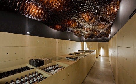
A worthwhile Australian contender, skincare brand Aesop’s Adelaide store somehow makes 7560 brown bottles look stylish. This isn’t the first time Australian architects March Studios have incorporated Aesop’s product packaging in their interiors – the company’s Flinders Street store, in Melbourne, features piles of cardboard boxes held to the wall and ceiling with netting, creating a sort of post-apocalyptic urban cave.
The beauty of the Adelaide store is in its simplicity – with the repetition of a single, unadorned object, the otherwise bare store is given new texture, shape, colour and light. We recall the ceiling of Tokyo’s UNDERCOVER store, which uses lightbulbs to a similar effect. The Aesop store’s single elegant display unit is a winner too; its height reminds us of hours spent pouring over CDs and LPs in the local record store.
It’s unsurprising that an Aesop store has made our list – the brand seems to be making an effort to showcase the work of some of the most exciting young architecture firms in the world. As Aesop’s founder, Dennis Paphitis said, “there's a direct correlation between interesting, captivating store spaces and customer traffic within a store."
Article continues on next page. Please click below.
Ann Demeulemeester, Seoul, Korea
{yoogallery src=[images/stories/2014/02/24/soe]}
Photos courtesy of De Zeen magazine.
The Seoul store of fashion label Ann Demeulemeester pulls off the contrast between modernity and nature with aplomb. The entirety of the building’s vertical surfaces, save its windows, are covered with densely-packed green foliage. In Seoul’s built up Gangnam district, the building provides a sleek urban oasis.
The building’s simple lines and colour scheme still manage to offer plenty of variance while keeping to its minimalist aesthetic. Inside, the living façade continues, with thick green moss covering the walls along the staircase that leads down to the building’s basement store. Anne Demeulemeester’s ground floor space maximises the greenery, with floor to ceiling windows offering views of foliage.
The Anne Demeuelemeester store, designed by Korea’s Mass Studies, is another on our list that features a wave motif, with a concrete ceiling that subtly rolls and swells across the space. Hopefully, this will put an end to the misconception that minimalist commercial spaces have to be severe.
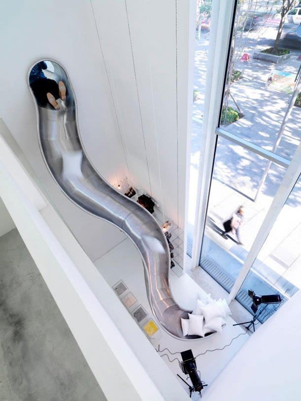
Honourable mention: Maison Martin Margiela, Beijing
Because the only thing better than Thomas Heatherwick's stairs would be a slide.
jrichardson@propertyobserver.com.au
