
Tale of two cities; What can be done about Melbourne's socio-economic polarisation?

SEIFA data confirms the existence of “two cities” with markedly different economic potentials. It’s not by any means certain though that planning policies to promote social mix would have much effect
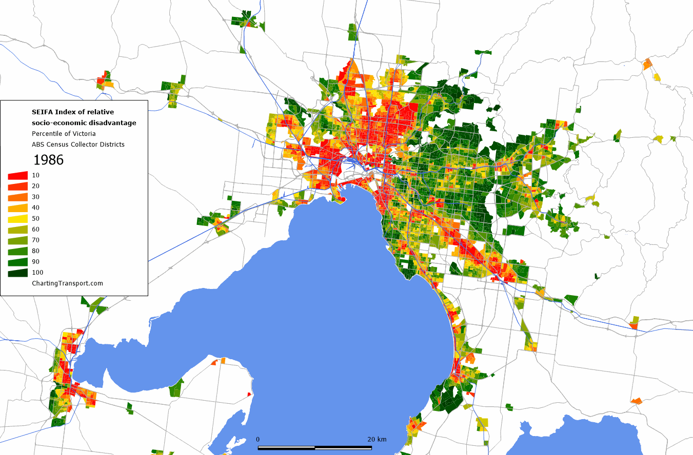
1986: Relative socio-economic disadvantage and advantage in Melbourne (source: Charting Transport)
2011: Relative socio-economic disadvantage and advantage in Melbourne (source: Charting Transport)
After a long hiatus, Chris Loader at Charting Transport has returned to business with this amazing visualisation of historical changes in the socioeconomic geography of Melbourne (see exhibit). The maps are specific to Melbourne, but it’s likely there’ve been similar changes in other Australian cities.
The maps are based on the SEIFA Index developed by the ABS. The Index uses Census data to rank areas of Australia by their relative socio-economic advantage and disadvantage.
Red means disadvantaged and green means advantaged. I’ve shown 1986 and 2011 for contrast, but if you click on the exhibits they’ll take you to Charting Transport where there’s an animation of the changes at each Census over the 25 year period.
The ABS says the maps are designed to give a snapshot at a single time and historical comparisons shouldn’t be undertaken “flippantly”. So, best to look only at the big picture. Also keep in mind the index measures the collective socio-economic characteristics of the people living in a particular sub area (1).
What first hits you in the face looking at these maps is the sheer scale of relative disadvantage in the north and west in 1986 and the sharpness of the divide along the Yarra. Then there’s the subsequent “decentralisation” of disadvantage from the inner city and inner suburbs to the outer suburbs over the period.
Most of the inner city was red in 1986, stretching out 20-25 kilometres from the CBD to the north and west and to the bay in the south. The inner eastern suburbs were green as were the outer eastern suburbs, although there were stripes of yellow and red along main transport corridors.
By 2011 however, there’s virtually no red within 10 kilometres of the centre in any direction, other than a few tiny areas (which are probably social housing estates). Within this bound, the eastern suburbs are almost uniformly green and much of the northern and western suburbs are gentrifying.
The Index fell over the period in some outer areas, for example the eastern suburbs beyond 15 kilometres radius. This could be due to the growing preference of higher income households for more central locations but it’s likely there are other factors at play too, including an aging population and new town house developments.
There’s also more yellow in the suburbs, much of it emerging from 2001 onwards (this is clearer in the animation by Census at Charting Transport). This might reflect growing inequality over the last 10 to 15 years.
There’s plenty of talk of the emergence of “two Melbournes” – the rich inner city and the relatively poor suburbs, especially the outer ones. The SEIFA Index however indicates that while the geography has changed, there were always two Melbournes (2).
The spatial pattern primarily reflects differences in preferences, amenities and economic resources transmitted via housing prices, but not entirely.
The better-off can out-compete those of more modest means to live close to the limited supply of better amenities and public goods like the CBD or the Bay. The pattern is exacerbated though by constraints on the supply of additional housing within established and outer areas. Increased supply could widen locational options for all by improving affordability.
Almost every planning strategy published in the last 20 years argues that increasing “social mix” is the appropriate way to respond to economic segregation. They reflexively propose that socio-economically mixed neighbourhoods should be actively pursued as policy (although they’re usually grossly deficient on how that might plausibly be achieved).
There’s doubt though about whether such policies can effectively tackle poverty or reduce income inequality. Researchers from the London School of Economics examined the issue (Cheshire et al: Policies for mixed communities: a critical evaluation) and concluded that residential segregation is essentially a consequence not a cause of income inequality (3).
They argue the evidence suggests an individual’s characteristics, economic outcomes and life chances are not sensitive to the neighbourhood they live in. A careful examination of the evidence currently available, they say, does not provide much support for the conclusion that mixed neighbourhoods are an effective way of relieving poverty and reducing social exclusion.
Our message from this review of the evidence is that creating mixed neighbourhoods treats a symptom of inequality, not its cause. The problem is poverty, what makes people poor and what keeps them poor; not the type of neighbourhood in which people live. Trying to create mixed neighbourhoods costs substantial resources that could be used directly to relieve poverty.
In a paper published this month, another group of researchers from the London School of Economics (Gibbons et al: Everybody needs good neighbours: evidence from student outcomes in England) examined 1.3 million English schoolchildren as they moved from grade six to grade nine (summary here).
Gibbons et al looked at changes in neighbourhood composition over the period and say they failed to find evidence of significant neighbour-peer effects on students’ scores.
From a policy perspective, the implication is that – on the educational dimension at least – programmes to promote socioeconomic mixing in communities through residential relocation are unlikely to be effective.
They did find some evidence that behavioural outcomes such as anti-social activities are affected by neighbourhood composition, so it seems this is a complex (not to mention emotive!) topic.
I expect that increasing housing supply would have some effect on economic segregation (e.g. see Do Sunbelt cities know how to increase diversity?), but the bigger picture is city managers and policy-makers should understand better what drives segregation at the neighbourhood and sub-regional levels; what the costs and benefits are (e.g. see Diversity in cities: does it have to be uniform?); and the limits of what planning can do.
1). As the designers of the first version of the ICSEA index (intended to help interpret NAPLAN school results – see Limitations of My School) discovered, a suburb which on average scores either high or low can nevertheless exhibit a lot of variation within the population.
2). My understanding of the deeper mechanics of SEIFA is limited. It might be that a score of 10 or 90 in 1986 means something very different to a score of 10 or 90 in 2011 e.g. the “distance” from 0 to 100 might have stretched considerably over the period (given rising inequality).
3). Henry Overman from the Spatial Economics Research Centre in London points to a Marxist analysis (Tom Slater: Your life chances affect where you live: a critique of the ‘cottage industry’ of neighbourhood-effects research) that makes much the same point: “By examining the structural factors that give rise to differential life chances and the inequalities they produce, and by inverting the neighbourhood effects thesis to: your life chances affect where you live, the problem becomes one of understanding life chances via a theory of capital accumulation and class struggle in cities.”
This article first appeared on Crikey.