
Lies, damned lies and housing statistics
Guest observation
We have a lot of property related data in Australia.
Information is released regularly by the Australia Bureau of Statistics (ABS), the Reserve Bank (RBA), a wide spectrum of state and territory and industry organisations, and private corporations.
There are plenty of stories that could be told based on all that information. But are we being told the right stories?
There is a common belief that statistics can be manipulated to support any argument, even the most outrageous claims. However, data does not lie.
It is the people who tell stories they want to tell regardless of what the numbers are. And this is how statistics get bad reputations.
The deception or, more often than not, just the misinterpretation of information due to plain and simple ignorance about the facts is possible because the audience is mostly clueless about what the data really shows. So, we trust the presenter and his or her good judgement and intentions rather than the numbers provided in support of the argument.
It is an art to ask the right question to extract the correct information from a bunch of numbers. And it appears that our education system has failed miserably to teach us how to do it properly.
Consequently, we are at mercy of news headlines and commentary proclaiming one extreme or another – if it is not the imminent price crash, then it must be a bubble.
But which issues are really at play and which are just imaginary, media fuelled propaganda? That is the question.
To make my point clearer, I am sure you have come across hockey-stick-like charts of Sydney house prices (similar to the one provided below) and commentary implying: "... they have reached extreme levels... are not sustainable... something must be done about it immediately...".
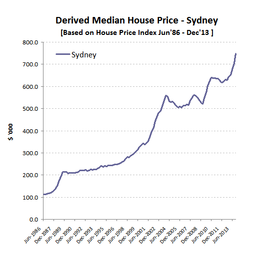
Source: Based on ABS data
Well, in absence of other contextual information, the steep rising line can give the impression of rampant and uncontrolled growth.
The impact of this visualisation on an uninformed observer can be quite dramatic and makes it easy for the commentator to draw quite plausible sounding conclusions that "everything is out of control". But appearances can be deceiving. Have a closer look at the following charts.
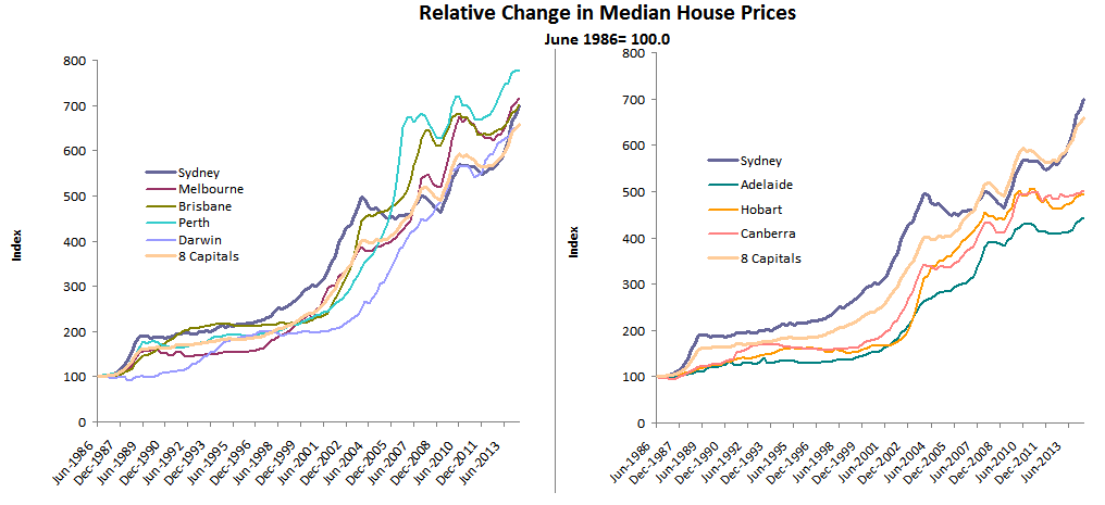
Source: Based on ABS data
It is the same data that many commentators are using and comes from the same credible source – the Australian Bureau of Statistics. However, this chart puts the information in the right context – that is, the chart compares price growth in Sydney to other capital cities and over a very long time.
These charts are more useful for describing the current state of affairs than looking at the headline statistic of 14%+ Sydney median price growth and proclaiming it is "a rampant speculation beyond all reasons". That is to say, looking at a single number without considering the broader context is meaningless.
In this broader and relative context, you can clearly see that the recent high price growth has just allowed Sydney to catch up to Brisbane and that Sydney is still behind Melbourne and Perth.
More interestingly, over the last 28 years, Sydney prices have not increased significantly more, in relative terms, than the weighted average of eight capital cities.
That is, in June 2014, growth of Sydney house prices over the 28 year period was higher than the national average by only 6.1%. In comparison, Brisbane house price growth was higher by 6.4%, Melbourne growth was higher by 8.7% and Perth by 17.6%.
So, is the current Sydney property price growth a manifestation of mad and speculative exuberance that everybody seems to easily diagnose? Or is it more likely to be the result of a normal market reaction to a long term underperformance, which should have been expected?
To highlight another aspect of how dangerous it can be to take information on the face value, please consider the above chart in the context of advice given to investors to "forget Sydney" and that "Brisbane is the market everybody should focus on next for growth...".
Of course, it is hard to make forecasts and draw far reaching conclusions based on just one, simple chart. However, this chart points to the likely reason as to why Sydney prices had the opportunity to grow so dramatically and why Brisbane price growth is so sluggish in comparison. That is, Sydney underperformed other large capital cities for quite some time while Brisbane property appears to be fully priced at the moment.
I am the first to stress that the above chart is not perfect and that it is far from providing the full story. In particular, it has been constructed based on an assumption that property prices were reasonably balanced across all capital cities in June 1986.
As shown on the chart below, this is a reasonable assumption. That is, median house prices for capital cities were in a relatively tight range in mid 1980's.
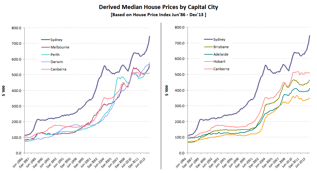
Source: Based on ABS data
Things are visibly out of balance at present but let's leave the explanation of the reasons this has happened for another opportunity. The graphs provide enough to say for now that there is a clear divide between larger cities such as Perth, Melbourne, Brisbane and Sydney, and smaller cities like Canberra, Hobart and Adelaide, with Darwin the only exception.
If you are still in disbelief about Sydney property prices not being out of the ordinary and think that one chart doesn't prove anything, here is another perspective to consider – relative to average full time adult incomes, the cost of buying a median priced house in Sydney is still 21% less than in 1986.
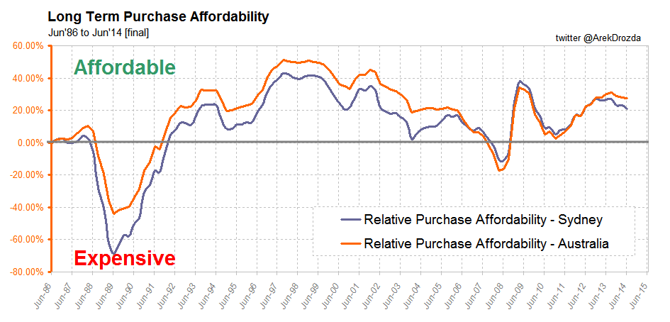
Purchase affordability in Sydney is declining and is lower than for Australia as a whole but there is still some room for prices and interest rates to move up before the affordability reaches uncomfortable levels (e.g. like it happened in 2008).
If Sydney property prices were indeed out of control, we would have seen the evidence no matter what statistic was used. This is clearly not the case.
In this article I highlighted only one issue – that is, incorrect interpretation of the growth of Sydney property prices. Just imagine how much more misinformation could be floating around in the media and on discussion forums, and how many prominent commentators may be totally clueless of what is really happening in the property market in Australia.
You cannot stop others from exaggerating facts and exploiting data for whatever purposes or agendas they may have, but you can control how you treat such information. I hope this example will make you think twice about what you read and trust from now on.
For a chance to learn more about what is happening with property prices in your area, post a comment below naming capital city you would like to be featured in a special report later this month.
Arek Drozda is an independent property market analyst.