
The property crash prediction S-curve (TM): What it can really tell us
Predicting the future or markets is not a science and since some people make bad financial decisions based on spurious predictions, the predictors absolutely deserve to be pulled up for their errors.
The world is not linear, and while pulling charts from thin air may look impressive, there is no way to predict markets with such certainty. In any case, you can invent a chart to 'prove' anything. Take our old friend, the good old S-curve. The x axis represents time passing (x to left, y to the sky, remember?), and the y axis cumulative data.

S-curves can be used for a number of different functions, such as to explain the technology life cycle, or the lifespan of a product.
An example? Say, the new users of a website such as MySpace. The number of new users started out slowly (early adopters), then the site became increasingly popular (early majority), then popularity exploded after Lily Allen started posting her recordings publicly on the site (late majority), and then the number of new users slowly flattened (laggards), eventually to close to nil. The MySpace cumulative number of users chart, if anyone has bothered to chart it (which I assume they have somewhere) probably looks something like my S-curve above.
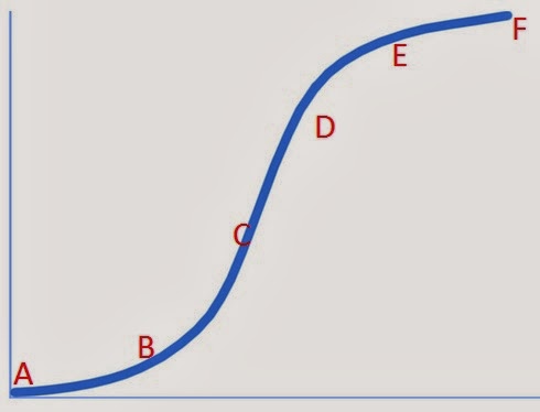
Point A (2007) - property prices in Australia's main cities have been flat after a boom through to 2004. All is quiet on the crash prediction curve.
Point B (2008) - "40% crash" predictions appear in the press. Bearish sentiment and crash predictions slowly begins to ramp up.
Point C (2009-10) - prices increase sharply in response to low interest rates. Property investors are variously termed as unethical, greedy and evil. The crashniks gain momentum. A price crash is described as inevitable.
Point D (2011-12) - the crash crescendo reaches fever pitch as property prices fall moderately. Anyone who owns a house is an idiot. American commentators say prices will crash by 60%...maybe up to 85% in certain areas. People will be wiped out. There is to be no escape from the unavoidable crash.
Point E (2012-14) - prices start rising again. ANZ Bank forecasts prices will rise by 15-20% by the end of 2015. In early 2014, bears begin to lose interest in the crash, capitulate and buy houses. Some join in and buy investment properties.
Point F (2016) - prices flatten off. We return to Point A on the chart.
Is there such a curve? No, of course not. It's absolutely ridiculous and I just made it up on the spot. But this is exactly the sort of thing that is used to sell books. All I need to do now is trademark it - "The Property Crash Prediction Curve" - and get it out to market.
Trends
In saying all of this, I have witnessed something akin to this more than once in London, and first time buyers are often said to wait until markets are rising before committing to buying.
In the modern era, first time buyers in large, mature capital city markets are likely to be in their 30s. There was a lot of talk about property prices crashing when the technology stock bubble burst around the turn of the century, and while sentiment did soften in some areas, there is only so long that people are prepared to wait for a crash.
It's happening in London again now, with Savills out forecasting five more years of price gains of around 25% from 2014 to 2019. Plenty of buyers took a step back from 2009, during and after the financial crisis, but since a man's working life is only so long there is a limit to how long people will wait before simply deciding to get on with it and buy a home.
Next page: What S-curves are really used for in property. Please click below.
What S-curves are really used for in property
Meanwhile back in the real world, and with my bean-counter head on, S-curves do actually have an important role to play in the property world.
When major developers undertake new projects, they are costed using an S-curve model or function, with cumulative labour and construction costs budgeted out through the life of the project. Deviations from the curve are then continuously monitored on an ongoing basis through variance analysis and through using project reporting accounting software packages.
Typically, a major development or construction project has relatively low planning, legal and application costs in its early days, before construction and labour costs ramp up sharply. Then, at the end of the project there will always be a few lagging costs, such as remedial work or disputed contracts, and the project reporting codes are then closed.
Development of new stock
You'd be forgiven for thinking from looking at the price of new apartments that developing companies are making obscene profit margins, but you'd be wrong. Once land, financing, government taxes and charges, labour and construction costs are booked and corporate overheads allocated to a project, developer margins are far from exceptional.
LendLease (ASX: LLC) released its Group Consolidated Results for the half year yesterday, showing a net profit of only $250m, from a colossal revenue of more than $6.5 billion for the half year. The Mirvac (MGR) results present a similar story. Stockland Group (SGP) is generating a Return on Equity (ROE) of well under 6%. Solid enough results, but hardly exceptional margins.
Construction costs
I spent a fair chunk of my career costing out (mining) construction projects and have been responsible for managing budgets that have suffered nasty adverse deviations from the S-curve and painful overruns. It's unpleasant. And if you have to go back to the equity markets for further capital raisings, it's more unpleasant still. For everybody concerned.
The capital expenditure report from the ABS shows that, for all the talk of mining construction having peaked 18 months ago, it is only now beginning to drop. The reason? Overruns, caused by the sharply increasing cost of doing business, variously including labour costs, construction costs and compliance.
The Gorgon gas project in north-west WA will cost $54 billion, possibly even more. The original budget was $37 billion (thankfully, I've never been responsible for an overrun like that monster!). The cause of that? Red tape and compliance. And as our society becomes more litigious, this is only going to get worse not better. You seemingly can't fire anyone these without a dozen written warnings or a large lump sum payout.Ask anyone who has managed or overseen a construction project in the last decade and they'll tell you the same thing: labour and construction costs in Australia are very painful. It's partly been driven by a surge in wages. We may have an implied inflation target of Australia of 2.5%, but wages growth has outstripped this figure every year since the inception of the Wage Price Index.
But that's only half of the story. Employing people in Australia today is not only a consideration of basic salary. When budgeting for project labour costs, additional provisions of up to 40% are sometimes needed for on-costs such as productivity, the superannuation contribution, Workers Comp insurance, payroll tax, annual leaving loading, long service leave provisions, and so on.
And even this is only part of the story. As my mining engineer friends in the field never tire of telling me: "You can't even take a leak without filling out a form these days". Coarse. But also true.
Article continues on next page. Please click below.
Focus on safety
Safety on construction sites is now rightly seen to be of paramount importance - people are more important than profits - and this is coming with a dollar cost attached.
In Sydney recently, we have seen the death of a construction worker in the field at Barangaroo, a horrific scaffolding collapse on Mascot's O'Riordan Street and a crane upended in Chatswood, all of which hit the newspaper headlines.
Rightly or otherwise, the press now sees construction accidents as fair game for news reporting and this brings with it an elevated reputation risk to companies.
Go to the ASX and take a read of any property development company or mining company results presentation - such as that of LendLease - and you will see that after a pretty picture on the front cover and a lengthy disclaimer, the slide we always put as number 1 is: "Safety". It was not always so, but this is now convention is mining and construction circles.
Reserve Bank highlights construction costs issue
One of the benefits of having and independent Central Bank is the independent analysis it brings, and the Reserve Bank in Australia has itself highlighted more than once the impact of higher construction costs on new residential housing stock.
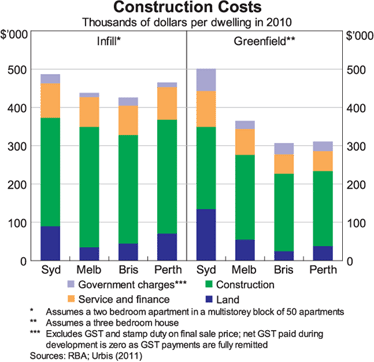
The land price for infill sites, even in Sydney is below $100,000 per dwelling. Of course, the land content appears low in the RBA's charts when compared to the median value of lots in the city. And indeed it is, for a couple of reasons.
Firstly, because the RBA has used outdated 2011 figures from Urbis as its source. And secondly because the RBA is looking at the lot value of land released for new dwellings as opposed to the median value of all lots, which is clearly going to be materially different, given the likely locations.Summary
In summary, we are not going to see materially cheaper land or property prices in Sydney because (a) the land for release is frequently on the outer fringe where few people want to live, and (b) as Urbis itself confirmed, not enough of new land gets released to meet demand anyway, which keeps prices pumped even further.Rest assured that, expensive as today's new residential projects may seem to off plan buyers, significantly cheaper new stock will not hit the market. Developers will not accept lower margins than they presently are, and since labour and construction costs remain elevated, so too will the price of new housing stock.
In any case, planners are fighting a losing battle against the manic population growth in the capital cities, which is another reason why for all these years I've argued against a price crash. The Sydney population over the last decade increased by around half a million persons - enough people to fill the main Opera House concert hall to its full capacity 187 times over. That's a lot of people.
Population growth at that pace (and faster still in 2013) doesn't necessarily equate to higher house prices, but it's hardly the recipe for a crash either.
OK, enough blurb from me. I'm off to trademark my new S-curve model.
Pete Wargent is the co-founder of AllenWargent property buyers (London, Sydney) and a best-selling author and blogger.His new book 'Four Green Houses and a Red Hotel' was released on 1 September 2013.