
Melbourne or Sydney? How our two biggest cities compare for liveability

GUEST OBSERVATION
The question of which city is the most liveable is an annual hot topic. Competition is fierce, especially between Melbourne and Sydney. We have previously highlighted the limitations of The Economist Intelligence Unit Global Liveability Index. In this article we analyse the differences between Sydney and Melbourne using clearly defined liveability indicators based on objective spatial data.
Liveability is an important concept with implications for health and well-being that go beyond promotional material or the prestige of being named number one. As part of our Creating Liveable Cities project, in July we released a scorecard looking at the liveability of Sydney. The scorecard for Melbourne comes out today.
For this research, we mapped policies designed to create liveable cities. We found great variation in these policies. Both cities do well on some but not all aspects of liveability.
We also found inequities in the delivery of infrastructure relating to liveability policies in both cities. Some suburbs do better than others, but in both cities suburbs on the urban fringe are less liveable. These areas often have poor access to the basic amenities needed for daily living.
So, let’s take a closer look at the liveability of Melbourne and Sydney.
Public transport access
Melbourne has an ambitious policy for public transport access. This requires 95% of residences to be within a 400-metre walk to a bus stop, 600m to a tram stop, or 800m to a train station. At present, 69% of residences meet this target.
The policy we measured spatially for Sydney is even more stringent. It requires 100% of residences to be close to public transport – within 400m of a bus stop with a service every 30 minutes, or 800m of a train station with a service every 15 minutes. Only 38% of residences and 2% of suburbs meet this target.
To create a consistent comparison between Sydney and Melbourne, we developed a common national liveability indicator that measures access (within 400m) to frequent public transport (a 30-minute service frequency). Results using this indicator were very similar: 36% of residences in Melbourne achieved this, compared to 35% in Sydney.
In both cities, however, inner and more established suburbs have the best public transport access. Many middle and outer suburbs miss out (Figure 1).
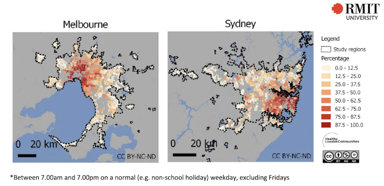
Figure 1: Percentage of residences by suburb within 400m of a public transport stop with a service every 30 minutes. Author provided
Another important liveability indicator measures how people get to work. This is especially important with growing population, increased traffic congestion and longer commuting times. Our research shows cities are healthier, more liveable and sustainable when walking, cycling and public transport are more convenient than driving.
Residents of Sydney are more likely to use public transport (26%) than residents of Melbourne (18%). The proportions who walk or cycle to work in each city are similar (6% Sydney, 5% in Melbourne). Both Melbourne and Sydney are doing well relative to other Australian cities.
By international standards, though, we have a long way to go. For instance, 50% of people (and 63% of MPs!) in Denmark’s capital, Copenhagen, commute daily by bike.
Walkability
Coinciding with good access to public transport are walkable areas, which combine somewhere to walk (to local shops and services), population density (to support the services) and a way to get there (connected road network). Walkable neighbourhoods are the backbone of a liveable city.
Figure 2 shows that in both Sydney and Melbourne inner areas have the highest walkability. This declines dramatically towards the urban fringe. Yet neither city has policies in place to achieve walkable neighbourhoods in the suburbs.
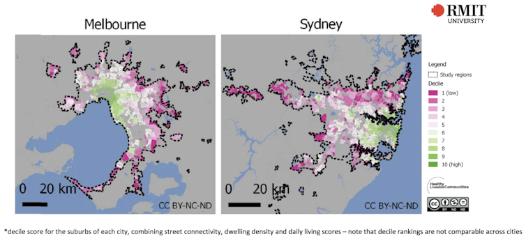
Figure 2: Composite walkability indicator* for suburbs within each capital city. Author provided
Walkability is also unlikely to be achieved with population density requirements set at only 15 dwellings per hectare. That’s too low to achieve walkable neighbourhoods.
Higher residential densities ensure there are enough people and the associated demand to support the transport and everyday services that help make cities liveable. Research is now showing that this requires higher densities of at least 25 dwellings per hectare, and even higher around activity centres and transport nodes.
Suburban densities are higher in Sydney, at 19 dwellings per hectare, than in Melbourne, which has only 13 dwellings per hectare.
Better policies create better cities
So to the question: which is the most liveable city? The answer in turn depends on another question: liveable for whom? Both cities have areas performing well on some liveability domains and other areas where more could be done.
The findings of these reports show a need for more ambitious policies, research evidence linking liveability indicators to health and well-being, and investment in infrastructure and spatial planning to improve liveability, health and well-being for all residents of all cities.
Lucy Gunn, Research Fellow, Healthy Liveable Cities Group, Centre for Urban Research, RMIT University, RMIT University; Billie Giles-Corti, Director, Urban Futures Enabling Capability Platform and Director, Healthy Liveable Cities Group, RMIT University; Julianna Rozek, Research Officer, Healthy Liveable Cities Group, Centre for Urban Research, RMIT University, and Melanie Davern, Senior Research Fellow, Healthy Liveable Cities Group, Centre for Urban Research, RMIT University
This article is republished from The Conversation under a Creative Commons license. Read the original article.

