
Australian property prices explained: Independent analyst
What everybody is telling us
The most common opinion about property prices in Australia is that our real estate is significantly overpriced or, that we are even experiencing a “property bubble”.
Evidence cited in support of the argument that prices are too high is that, in the past, median property prices were three times the average household disposable income but now that multiple is as high as six times the average.
An alternative measure, used less frequently in debates, is the ratio of house prices to rental costs – this ratio is now almost double of what it used to be a couple of decades ago.
Both these statistics show that property prices have increased twice as much as household disposable incomes and rents in the last twenty odd years. Therefore, it is easy to jump to a conclusion that, from a historical perspective, residential real estate in Australia must be significantly overpriced. But is this a correct conclusion?
There is a problem
As outlined in my last article about a property bubble in Australia, the above measures are rather inadequate for the purpose of describing short and medium term fluctuations in property prices, and whether these prices are “excessive” or not.
The key problem with the above ratios is that they have higher values now than in 2000’s, which in turn were higher than in 1980’s, which were higher than in 1970’s, which again were higher than in 1950’s… You get the picture. It is frankly impossible to draw any rational conclusions using these measures.
An alternative approach for better insight
To better depict what is actually happening in the market, we need to consider relationships between several factors that directly influence property prices – not simplistic measures like ratios of prices-to-rents or prices to household disposable incomes.
I have selected three different measures that, when presented together, describe more accurately what is happening with property prices. These are:
- incomes – which reflect affordability; I opted for adult full time average weekly earnings which are more relevant to a property buyer cohort and are a less artificial measure than household disposable incomes;
- rents (from CPI index) – which are indicative of a relative cost of accommodation for renters (since renting is a substitute for owning a property there is a direct relationship between the costs of both accommodation options); and
- cost of buying – which is indicative of the relative cost of accommodation for owner occupiers (I am using a proxy measure which is simply equivalent to interest payments on a 100% loan on a median priced house);
I acknowledge that the “cost of buying” measure has its critics but there is a simple explanation why this is the correct statistic to use for direct comparisons with rental costs and affordability and not property prices. In particular, these days hardly anyone purchases a property outright so, the price of a property is only a secondary consideration in the purchase decision.
Yes, you read it correctly. Far more relevant for the purchase decision is the annual cost associated with buying a property - comprising of mortgage payments, council and water rates, maintenance costs, etc. Even more importantly, consideration also needs to be given to how this cost compares with rental costs, since renting is a close substitute for buying.
That is, the maximum affordable price of the desired property is worked out based on the buyer’s existing financial resources (i.e. cash and/or equity in currently owned property) as well as the buyer’s borrowing capacity (which is directly linked to buyer’s income and prevailing interest rates).
All in all, in order to proceed with the purchase, personal or family financial capacity has to at least match the annual cost of buying.
Paying off the loan principal is omitted in the analysis since it equates to savings and is therefore deemed irrelevant (i.e. every dollar that is paid off becomes owner’s equity that can be drawn upon in the future). Again, I acknowledge criticism of this point of view but I leave detailed explanations of its merits until next opportunity.
With this background, let’s now compare information on personal incomes, rents, costs of buying and property prices over the last 27 years.
The simple truth
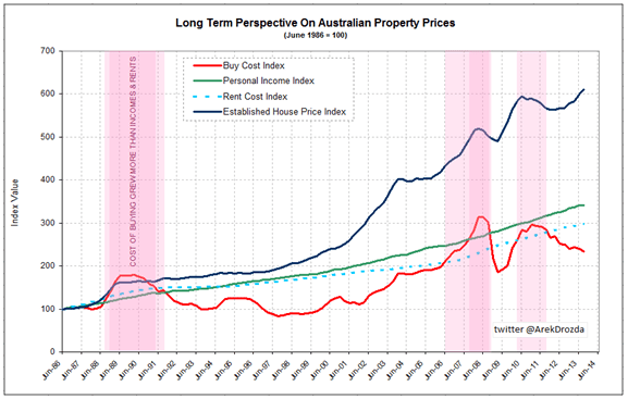
Source: Based on ABS data
The chart reveals quite an interesting picture. In particular, despite a six-fold increase in property prices, the cost of buying a median priced house in Australia has risen less than two and a half times in the corresponding period (the actual Sep-13 index value is 234.1).
The increase in the cost of buying is substantially less than increases in personal incomes (adult total full time weekly earnings May-13 index value is 341.5) as well as in the cost of renting (rent component of the Consumer Price Index Sep-13 value is 298.6).
In other words, relative to the incomes of Australians working full time, the cost of buying is significantly lower now than it was 27 years ago. And rents are also a lesser burden now than they were in 1986. Therefore, if housing was affordable then, it is even more affordable now.
Undoubtedly, this conclusion will raise a few eyebrows since it contradicts many “informed opinions” that circulate in the media. So, let’s examine the chart a bit closer to see how well it reflects the reality.
A few words about the chart
The reason for selecting 1986 as a starting point is simply because this is when official ABS house price index data begins. This was neither an extremely low nor extremely high price point, hence is a quite reasonable year to use for benchmarking.
It is also very close to 1985, a year that Steve Keen, economist and a prominent media commentator, nominated as the year when “houses were affordable” and that he uses as a reference point in his analysis. So, no bias here whatsoever.
Let me also stress the fact that there is no conflict between this chart and the two ratios mentioned at the beginning of the article. That is, the chart clearly shows that property prices had grown at twice the rate of incomes and rents over the 27 year period.
However, in addition, this chart also illustrates the relationship between incomes, rents and the cost of buying which provides the explanation as to why property prices have risen so dramatically.
That is, current property prices are the result of incomes, rents and the cost of buying keeping in a relative balance over an extended period of time.
Turn over page for "The real story behind the numbers"
The real story behind the numbers
The story that this chart tells is surprisingly accurate. In particular, a combination of explosive rises in property prices and interest rates in late 1980’s resulted in buying costs reaching a level that could be considered a “bubble” (this was a period of high volume of sales and high prices).
Although the “recession we had to have” shook buyer confidence, prices did not fall. It was simply because a drop in interest rates brought down the costs of buying quite fast and this provided strong support for the then price level.
The cost of buying kept falling for almost a decade, to the extent that by early 1998 it was only half of what it had been in 1990. On the other hand, incomes and rents grew steadily, compounding the perception that properties were getting extremely cheap.
It meant prices had a lot of room to move. And they moved indeed – as much as three times in some locations in a relatively short period of time.
This jump in prices was merely a catch-up as Australians rediscovered their true financial capacity. It wasn’t until 2008 that a combination of continuous price growth and hikes in interest rates pushed the cost of buying again into an unaffordable territory.
The unfolding Global Financial Crisis quickly deflated this bubble – a reduction in buyer confidence led to a small drop in prices and the RBA swiftly engineered a big cut in mortgage rates to bring rates down to historically low levels and, in effect, dramatically reducing the cost of buying.
By March 2009 the cost of buying reached a bargain level again. These developments, combined with an additional stimulus for first home buyers, generated quite a lot of demand for residential properties, pushing prices higher in a very short period of time. The RBA reacted again, lifting rates in a hurry and the cost of buying caught up with the strongly growing incomes and rents at the time.
That brings us to present times. Renewed financial troubles reduced buyer enthusiasm for property. A moderate fall in prices from the peak reached in mid-2010, and interest rates retreating back to historically low levels, brought about a reduction in the costs of buying yet again.
However, the falls in those costs were not as sharp as in 2009, or as prolonged as in the 1990’s. Nevertheless, from a historical perspective, the reduction in the cost of buying was enough for real estate to be considered if not an outright bargain, at least well within the financial capacity of working Australians. And then prices started rising again…
Historical perspective with real data
The ultimate check of accuracy for the information presented on the above chart is a comparison of actual prices from the past and present – and the match is pretty good, as this sample of statistics for Sydney demonstrates:
| June 1987* | Sep 2013 | Change |
Median House Price
| $104,000 (Sydney annualised) | $627,000 (Jun’13) (Greater Sydney) | 6.0 times higher |
- 3B house | $8,580 ($165 p.w.) (Metropolitan, dwelling) | $28,600 ($550 p.w.) (Greater Sydney) | 3.3 times higher |
- 2B apartment | $7,280 p.a. ($140 p.w.) (Metropolitan, dwelling) | $24,960 p.a. ($480 p.w.) (Greater Sydney) | 3.3 times higher |
Full Time Adult Total Earnings (Seasonally Adjusted) | $24,528 p.a. ($471.70 p.w.) (NSW Aug’87) | $75,634p.a. ($1,454.50 p.w.) (NSW May’13) | 3.1 times higher |
Buy cost proxy (100% mortgage on median priced house) | $16,120 | $37,306 | 2.3 times higher |
Standard Variable Mortgage Rate | 15.5% | 5.95% | 62% lower |
Mortgage cost as % of full time adult wages | 66% | 49% | 26% lower |
Ratio of full time adult wages to median house price | 4.2 | 8.3
| 2 times higher |
Rent as % of full time adult wages (house) | 35% | 38% | Relatively unchanged |
Ratio of median price to Median rent (house) | 1 | 1.8 | Almost 2 times higher |
Source data: RBA, ABS, Housing NSW, Stapledon UNSW.
* Note: 1987 data used in absence of full set of statistics for 1986
Final comment
The chart presented in this article is a simple construct but is sufficient to explain what has happened with Australian property prices over the last three decades.
I am open to a constructive criticism but frankly speaking, in my extensive research on the topic, I did not come across anything else that would provide such accurate narrative to real life events.
The ratios favoured by economists and some property market commentators do not offer much of an insight in comparison. Since the validity of these ratios has been undermined, at least in my view, I believe it is time to find more suitable alternatives to better explain what is happening in the property market in Australia.
To conclude, the message is clear – based on the income capacity of working Australians, residential property in this country is not overpriced and prices are far from bubble territory. We can afford current prices – and we can afford them more than in 1986. The only hurdle is that it requires accepting a level of debt that many may not feel comfortable with.
Arek Drozda is an independent analyst who has worked in the public and private sectors for over 20 years in business development, data analysis and in building geographic information systems.

